Maison Mahjong 雀舍
Brand Strategy, Brand Identity, Printed Collateral
2026


An identity system for hospitality pop-up Maison Mahjong 雀舍 to rejuvenate tradition.
Drawing typographic inspiration from the jostling street signs of Hong Kong and one of yum cha's most distinctive table features, the "Lazy Susan", the dynamic energy of banquet halls is captured visually.
Constructed across a circular grid, bold roman and chinese typography frames brand expressions into an intricate, hypnotic focal point. Within, the symbol of the sparrow, associated with 雀‘s dual-meaning as both mahjong and sparrow, creates strong directional lines and ornamentation to compliment a modernised “lucky red” palette. In doing so, Maison Mahjong 雀舍 rejects the hospitality industry’s over-reliance on Western “luxury” aesthetics of excess negative space and rigid grid systems, in favour of an identity that recontextualises Chinese heritage for a modern audience.
Made at SCCO Studio.
Drawing typographic inspiration from the jostling street signs of Hong Kong and one of yum cha's most distinctive table features, the "Lazy Susan", the dynamic energy of banquet halls is captured visually.
Constructed across a circular grid, bold roman and chinese typography frames brand expressions into an intricate, hypnotic focal point. Within, the symbol of the sparrow, associated with 雀‘s dual-meaning as both mahjong and sparrow, creates strong directional lines and ornamentation to compliment a modernised “lucky red” palette. In doing so, Maison Mahjong 雀舍 rejects the hospitality industry’s over-reliance on Western “luxury” aesthetics of excess negative space and rigid grid systems, in favour of an identity that recontextualises Chinese heritage for a modern audience.
Made at SCCO Studio.
SUBVERSUS
Brand Strategy, Brand Identity, Digital Design
2026


A flexible brand platform for artist collective SUBVERSUS, to scaffold creativity without rigidity.
Recognising the collective’s wide variety of artists, mediums and formats, we constructed a brand platform that could adapt and respond flexibly to content and context.
Acknowleding the emergent strength of the collective through the combination of its constituent artists, we began by creating the brand’s logo from constituent points. Emphasising the structural role SUBVERSUS plays within each artist’s practice, these points were then extrapolated to structure the digital platform and explicitly indicate the grid system beneath. Here, differences across works, their formats and their sizes are not crushed into a uniform series of rectangles, but instead left varied as they slot into the most appropriate point within the grid. Depending on the sequence of works and the user’s screen size, these layout then adapt organically, highlighting SUBVERSUS’s capacity to house and champion a breadth of creative excellence.
Made at SCCO Studio.
Development by Site By Sasha.
Recognising the collective’s wide variety of artists, mediums and formats, we constructed a brand platform that could adapt and respond flexibly to content and context.
Acknowleding the emergent strength of the collective through the combination of its constituent artists, we began by creating the brand’s logo from constituent points. Emphasising the structural role SUBVERSUS plays within each artist’s practice, these points were then extrapolated to structure the digital platform and explicitly indicate the grid system beneath. Here, differences across works, their formats and their sizes are not crushed into a uniform series of rectangles, but instead left varied as they slot into the most appropriate point within the grid. Depending on the sequence of works and the user’s screen size, these layout then adapt organically, highlighting SUBVERSUS’s capacity to house and champion a breadth of creative excellence.
Made at SCCO Studio.
Development by Site By Sasha.
Oliver Du Puy
Brand Strategy, Brand Identity, Digital Design
2025


A timeless identity and digital platform for architect Oliver Du Puy.
With the growing inability of Oliver Du Puy’s existing brand to fully capture the practice’s sophisticated sensibilties, new foundations needed to be laid for an enduring legacy.
Pairing a restrained creative direction with an understated serif wordmark, ample negative space and a monochromatic palette, the revised brand identity articulates Oliver Du Puy with serene authority. In providing a more subtle system emphasising clarity of expression, the practice is better positioned to champion their work succinctly through a wealth of photography.
Made at SCCO Studio.
Development by Site By Sasha.
Photography by Tom Ross.
With the growing inability of Oliver Du Puy’s existing brand to fully capture the practice’s sophisticated sensibilties, new foundations needed to be laid for an enduring legacy.
Pairing a restrained creative direction with an understated serif wordmark, ample negative space and a monochromatic palette, the revised brand identity articulates Oliver Du Puy with serene authority. In providing a more subtle system emphasising clarity of expression, the practice is better positioned to champion their work succinctly through a wealth of photography.
Made at SCCO Studio.
Development by Site By Sasha.
Photography by Tom Ross.
Daily Practice
Brand Strategy, Brand Identity, Printed Collateral, Wayfinding, Digital Design
2025


A modular identity for Daily Practice to unify a dual-concept store into a single vision.
Created as a system of two halves, a high-contrast colour palette and typographic pairing finds structure through complimentary symmetry across the brand’s retail and canteen offerings. Consolidated through a modular grid system, each offering is more clearly demarcated across layout and palette to position Daily Practice as optimised yet meditative, contemporary yet timeless.
Made at SCCO Studio.
Photography by Taje Singh.
Created as a system of two halves, a high-contrast colour palette and typographic pairing finds structure through complimentary symmetry across the brand’s retail and canteen offerings. Consolidated through a modular grid system, each offering is more clearly demarcated across layout and palette to position Daily Practice as optimised yet meditative, contemporary yet timeless.
Made at SCCO Studio.
Photography by Taje Singh.
HotStuff°
Brand Strategy, Naming, Brand Identity, Packaging
2025



A comprehensive identity and go-to-market campaign for heat therapy company HotStuff°.
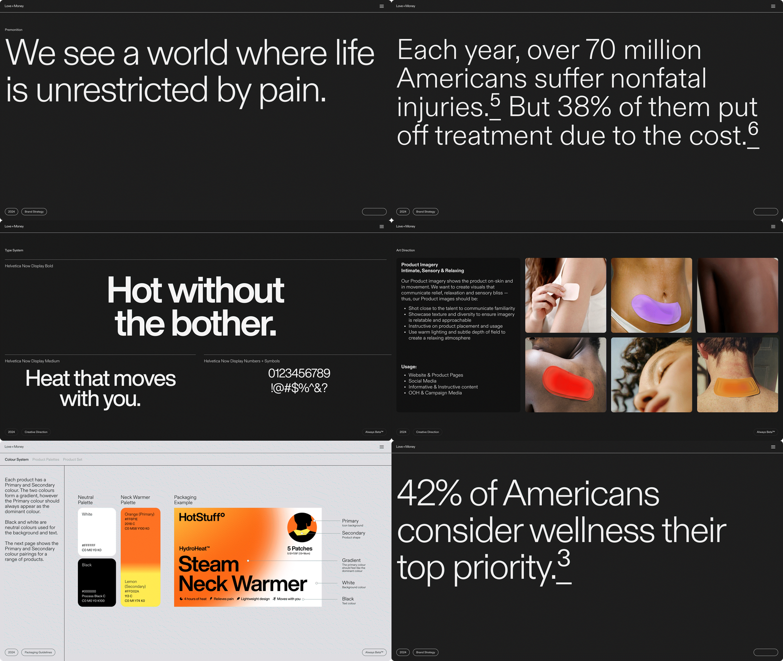
Through initial research into the condition of healthcare in the United States, it was revealed that while 70 million Americans suffer injuries each year, 38% of them put off treatment due to the cost. Providing the cost-effective treatment needed to bridge this gap but lacking the design sensibilities to articulate how, a holistic identity system was created to provide HotStuff° a successful expansion into the United States.
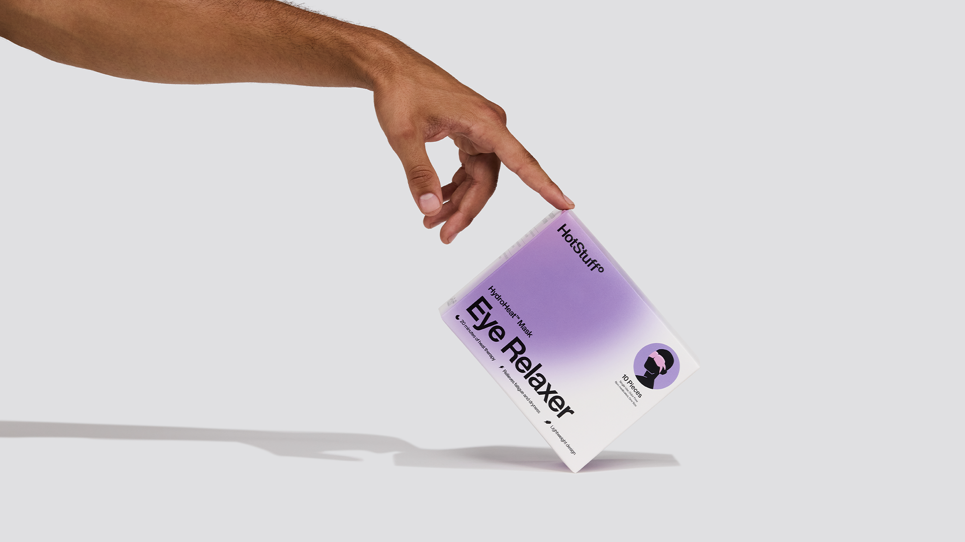
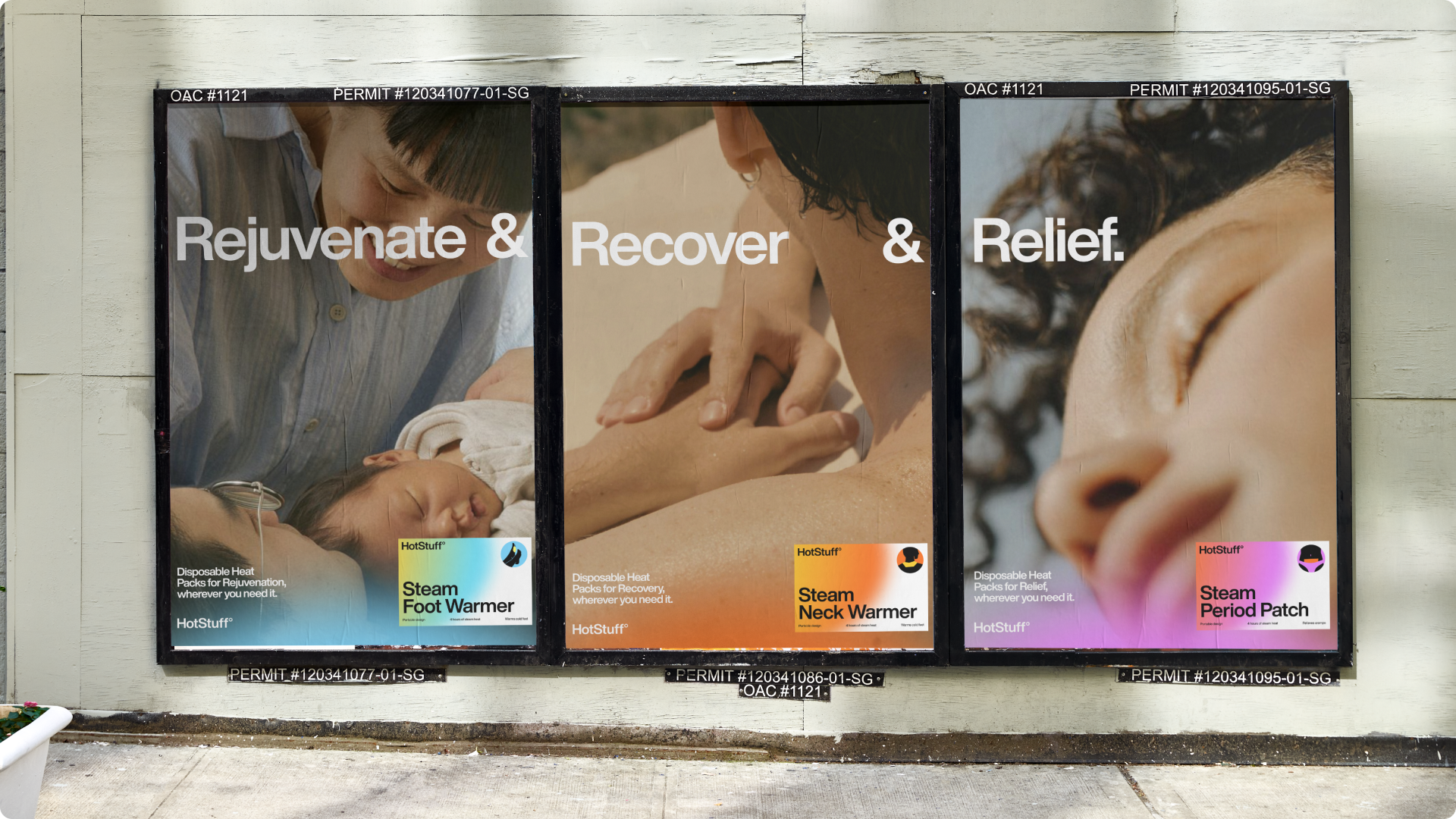
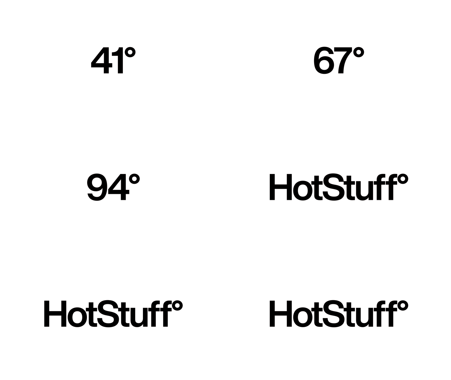
Leaning on modernist sensibilities, HotStuff°’s identity hinges on lucid typography, an extensive colour system, and intimate, sensory lifestyle photography to succinctly express what a world without pain really feels like.
Made at Love + Money.
Through initial research into the condition of healthcare in the United States, it was revealed that while 70 million Americans suffer injuries each year, 38% of them put off treatment due to the cost. Providing the cost-effective treatment needed to bridge this gap but lacking the design sensibilities to articulate how, a holistic identity system was created to provide HotStuff° a successful expansion into the United States.
Leaning on modernist sensibilities, HotStuff°’s identity hinges on lucid typography, an extensive colour system, and intimate, sensory lifestyle photography to succinctly express what a world without pain really feels like.
Made at Love + Money.